With just moments until first kick-off, the new NWSL kits are finally revealed. Nike’s new kits range from a basic template, to bold new designs. In the spirit of “look good, feel good, play good”, here’s the definitive preseason ranking of the 2023 NWSL kits.
13 – North Carolina Courage
Over the past few seasons, the Courage have seen their championship-winning players leave. This kit is perfectly symbolic for a fresh slate. The texture and same-color crest are reminiscent of the 2022 Lionesses kit. That kit was *also* boring. This is a ranking, and someone must be in last place. Better luck next season.
12 – KC Current
The KC Current are a late entrant to the 2023 kit race, dropping their new away kit on Friday morning. Like North Carolina, they went with an all-white shirt, away from last season’s teal accents. The teal shorts and socks are cool, but those elements shouldn’t be the coolest part of your kit. Looking forward to 2024, and the removal of the white kit restraints.
11 – San Diego Wave
I’m not angry at this kit. I’m just disappointed. San Diego Wave came on the scene with the most Lisa Frank crest and color scheme, and made this basic template kit for the second season in a row. To their credit, the name set patterns and jock tags are fun. It would’ve been nice to see that whimsical energy on the rest of the kit.
10 – Washington Spirit
The Spirit went plain and understated this season. The contrast-shiny crest adds a little fun, but with rumors of bigger and better things down the pike, its hard to see this kit as anything but a placeholder.
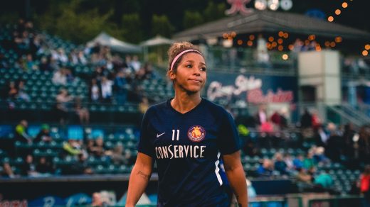
9 – Orlando Pride: Luna
The Luna kit revamp fixes some major problems from last season: white shorts, and low-contrast numbers. The moon is a beautiful and colossal phenomenon. On a kit, it’s a dull gray. It would’ve been cool to see a contrasting sparkly silver instead. Points for making improvements, though.
8 – Angel City
ACFC went hard in year one with the Daylight kit. It was going to take something truly magnificent to make it cooler. The design features the LA basin and coastline, reminiscent of the Chicago Elevated kit. Their color palette has a deep bench of colors, and surprisingly, they went with gray. Sorry. “Armour”, described in the press release as speaking to “dedication and determination: Angel City has visionary goals that can only be achieved through hard work and courage to break barriers. The English spelling, which is intentional, honors the game’s roots.”
Like the on-field team, The Represent Kit should have tried looking to the bench for contributions.
7 – Portland Thorns
The Portland Thorns kit leaked online and immediately divided woso twitter with its bold new look. The new kit has the power to turn each player into their own evil twin. Portland took a big swing on this one, which is more than what they can say about last season’s kit. It’s better to have swung and missed, than to not swing at all. Who knows, opinions may sway after seeing the kit in action!
6 – Houston Dash
Houston has a decent kit history but tend to fly under the radar. At first glance, the Estrella kit appears to be a solid orange shirt. Look closer, and you’ll see a subtle, star-bursty pattern. It’s very solar flare, and entirely on brand for Space City. It gives a solid color, without being too boring, and is a nice progression from last season’s look. Solid, reliable, dependable… it’s a Houston kit.
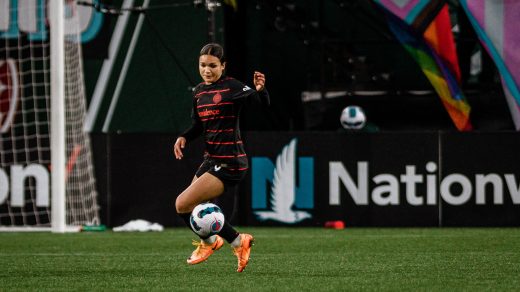
5 – Orlando Pride: Highway Woman Kit
The Ad Astra kit might be the coolest kit in recent memory. The space launch certainly didn’t hurt. Like the Daylight kit, it was always going to be tough to top. The Highway Woman kit comes as a tribute to Florida artist Mary Ann Carroll, connecting the team to its local roots. Many of the press photos for this kit are under dark mood lighting, so it’ll be nice to see how the brushstroke patterns pop during a day game.
4 – OL Reign
OL Reign takes a page from the dazzle kits of days past. I like how they changed the line’s curvatures and width. It gives you a lot to look at without being entirely too much. This kit has that “cool shirt” factor that we’re seeing more in this league–fans like a shirt they can wear away from the stadium.
3 – Racing Louisville
Louisville leaned in to their city’s racing history, and gave us a houndstooth tribute kit in honor of Penny Chereny, the owner of Triple-Crown winner Secretariat. The kit marks a new start for the club. The floral design on their inaugural kit was historic, but became a remnant of their troubled past. The photoshoot looked super fun for the players, and its nice to see Louisville chart a new path.
2 – Chicago
Angel City wishes they could do a city kit like Chicago. Their 2019 Elevated kit was the catalyst for kit design in the league. This kit takes the Red Stars’ tradition of fantastic city kits into the future. The Chicago six-pointed star pattern “represent the bedrock of the foundational framework being laid as we prepare to enter a new chapter for the club.”
1 – Gotham
I’m a sucker for a striped kit and we haven’t seen one in the NWSL since The Washington Spirit in 2018. I like the colors, I like the zig zag in the stripe, I like the graffiti motif. Everyone else was doomed after this drop. It’s the 2023 preseason kit champion, DEAL WITH IT.